I chose to emphasize this project because it's the most in-depth one I worked on while at DevRev. I want it to show how I kept refining and improving a fundamental experience through many iterations.
Problem
Important updates were hard to find in a feed sorted by time. Notification cards often left out the context people needed, so they had to open the related item to understand what had changed. New conversations and frequent alerts added to the clutter.
Outcome
We shipped an updates feed that grouped related notifications and gave people more context at a glance. I was the product designer on an eight-person team that included a product manager and iOS and Android engineers. We worked on the project for three months.
Objectives
I wanted people to find important updates quickly, revisit an update and act on it later, and see enough context on each card to understand what happened before opening it.
Existing experience
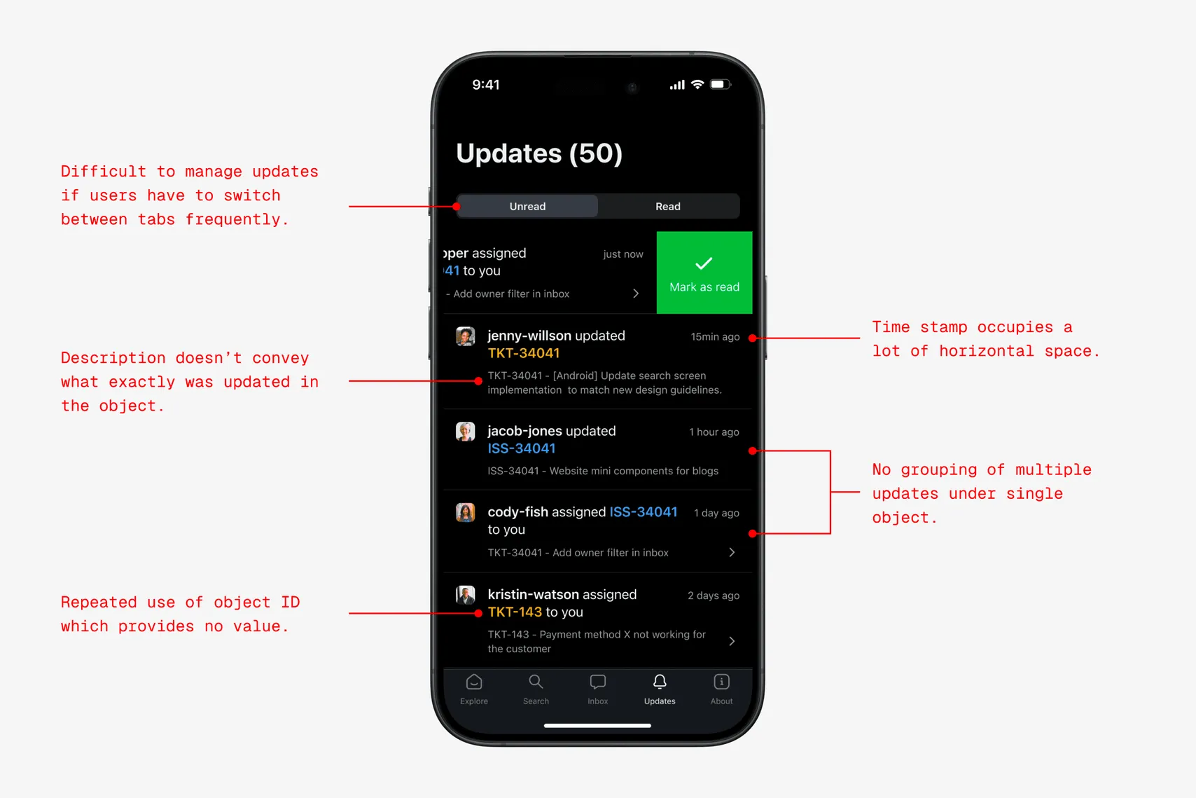
The original feed put all organization updates in one place. It showed each notification separately, even when several updates came from the same object or bot.
Grouping related notifications
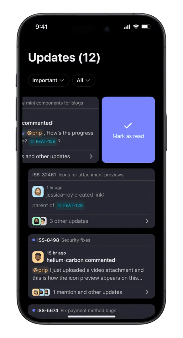
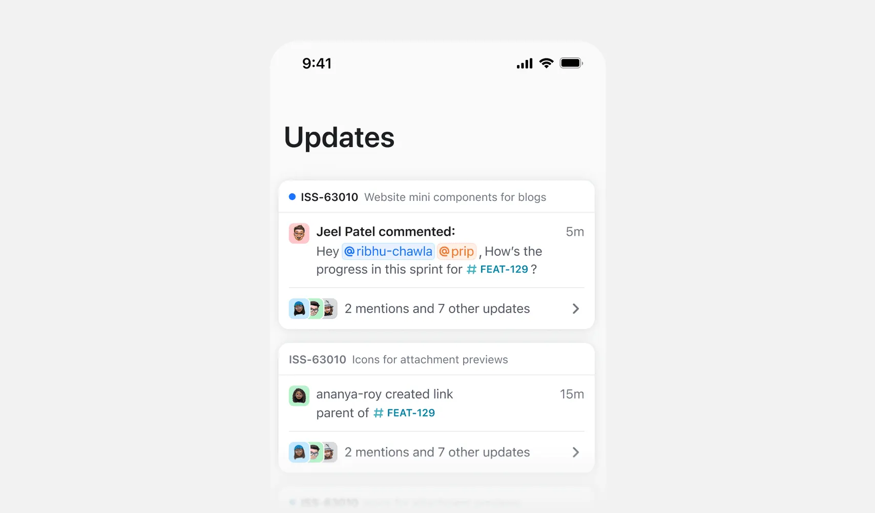
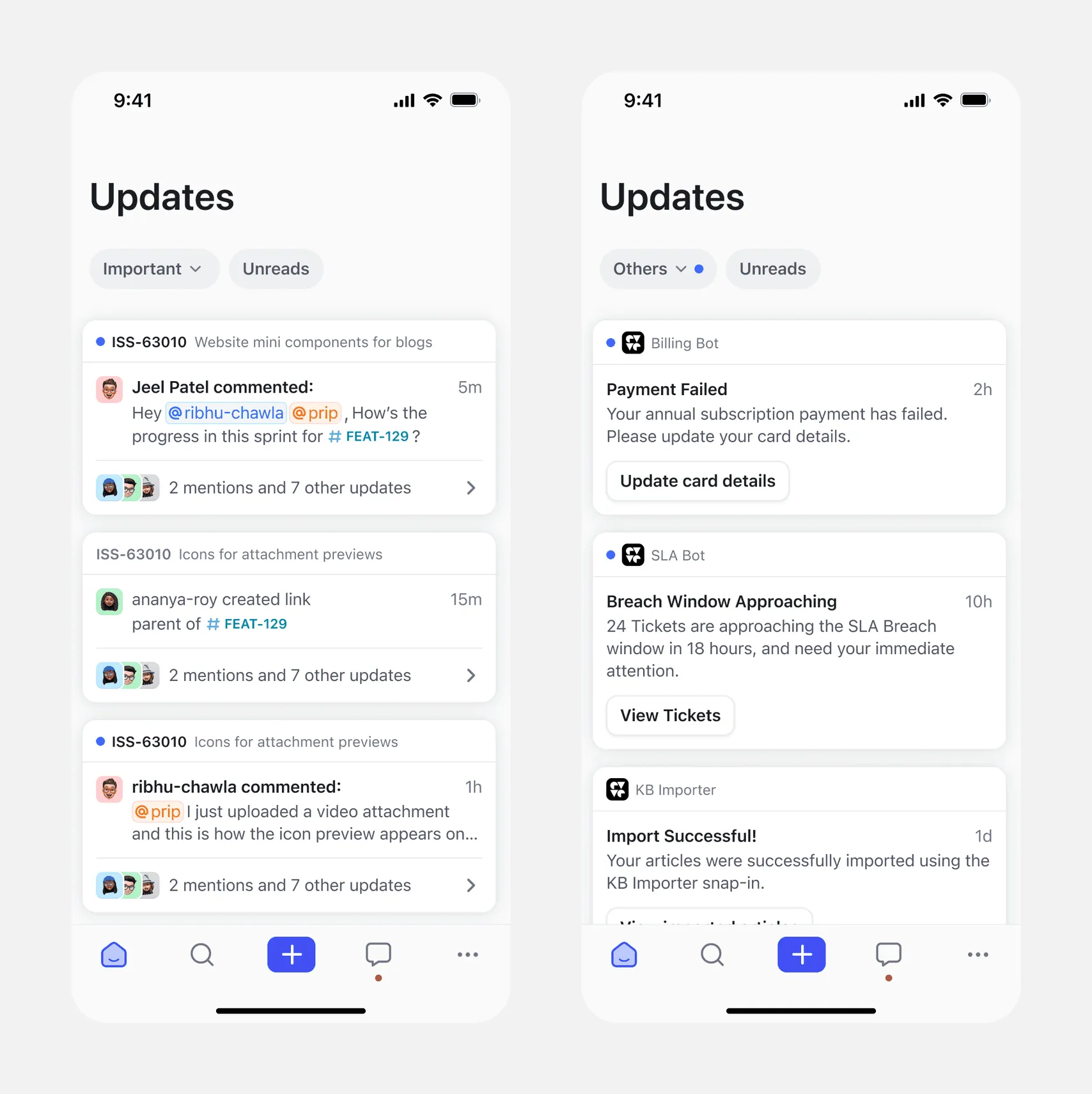
We grouped updates for each object or bot into one cluster so people could see the latest activity in one place. Each cluster shows the notification type, sender, timestamp, and message. People can snooze, mark as read, or manage a subscription directly from the cluster.
I explored several variations for the notification cluster design. Here are a few key ones worth highlighting.
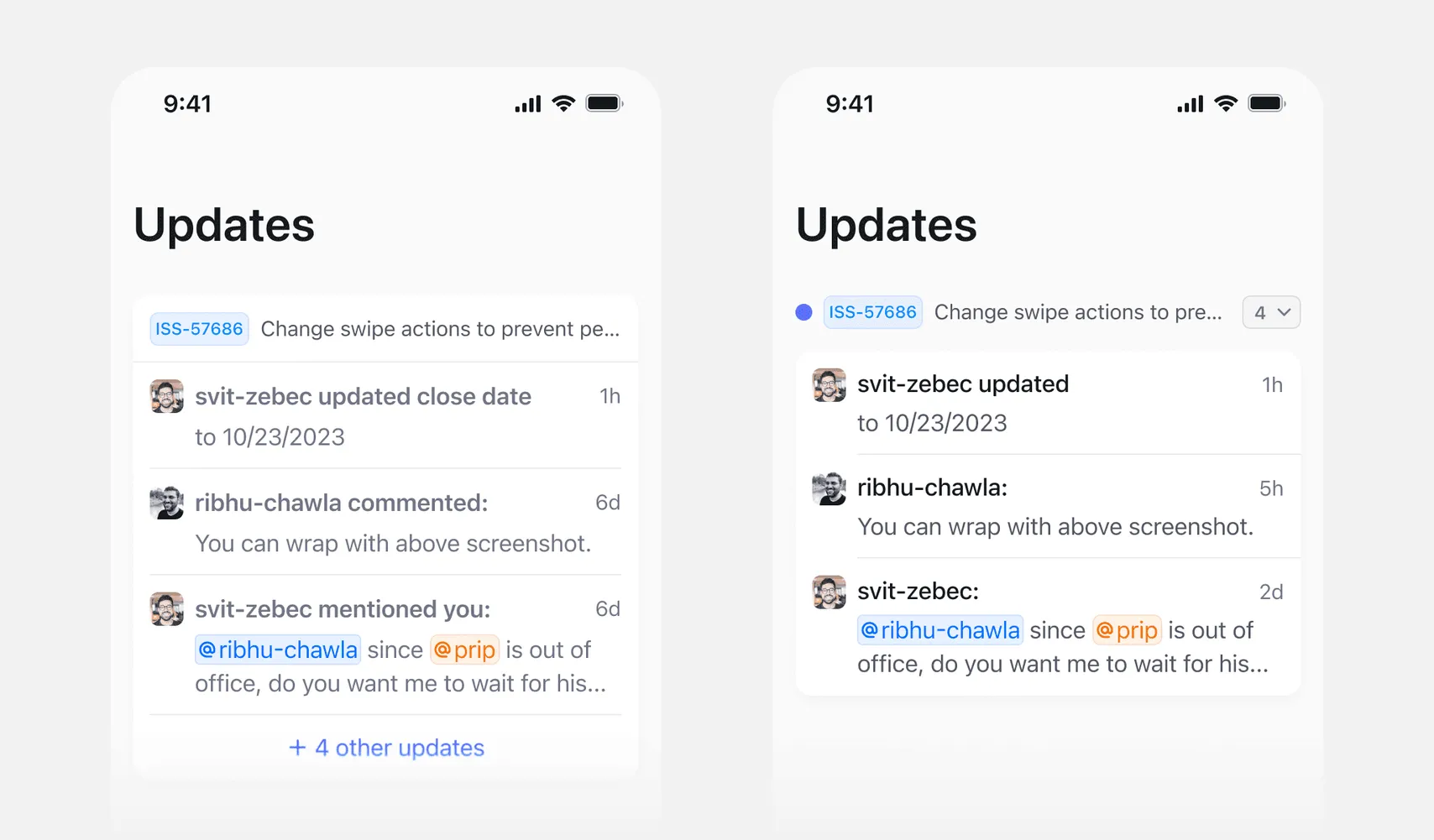
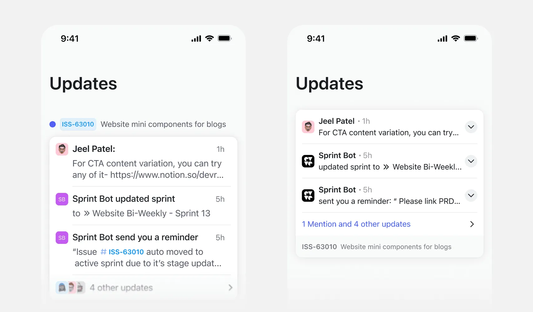
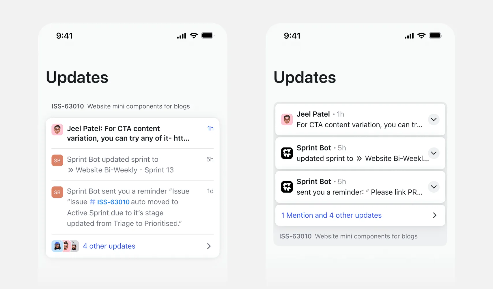
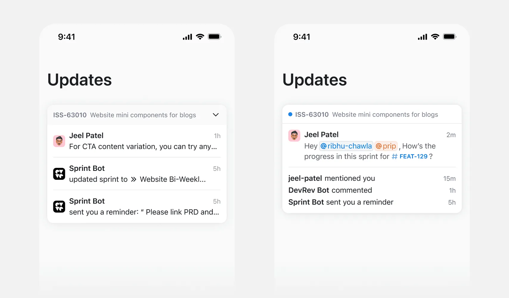
We chose this direction because it best met all our objectives. Swipe actions work more intuitively on the entire cluster, and the visual hierarchy felt the strongest here.
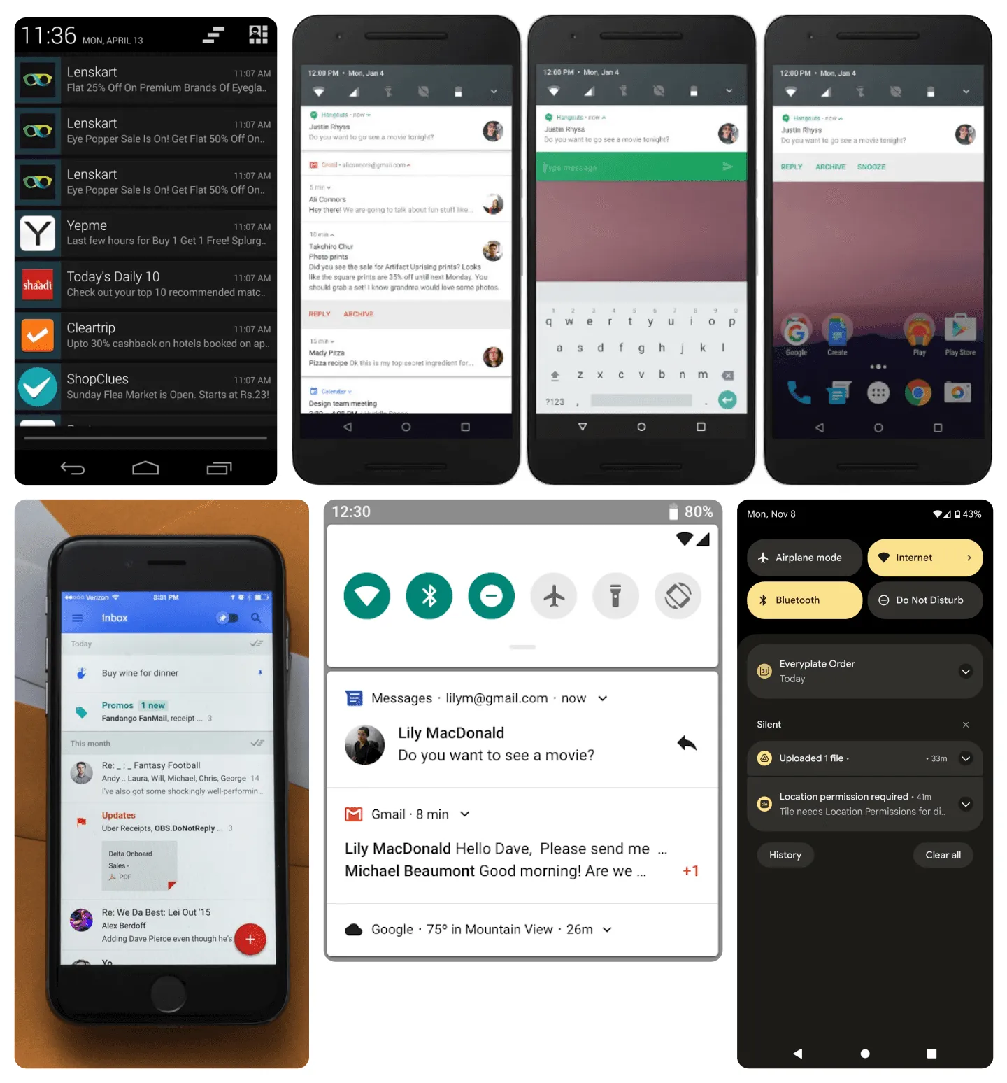
I looked at older versions of Android notifications and the Google Inbox app for inspiration. I think they did a great job with gestures and organizing information.
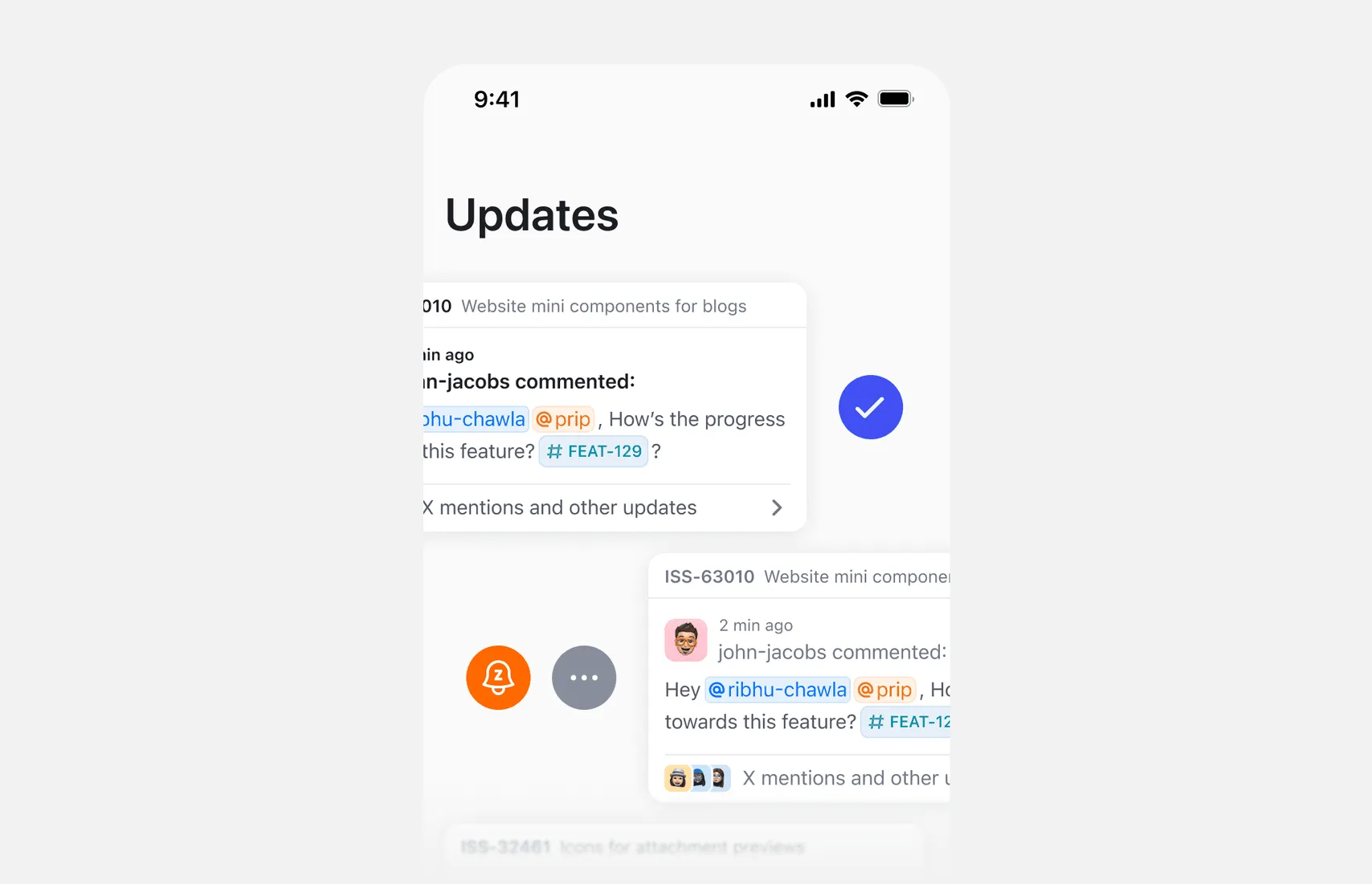
Actions on clusters
A cluster can have options to mark as read, snooze, or manage subscription.
Defining a great filtering experience
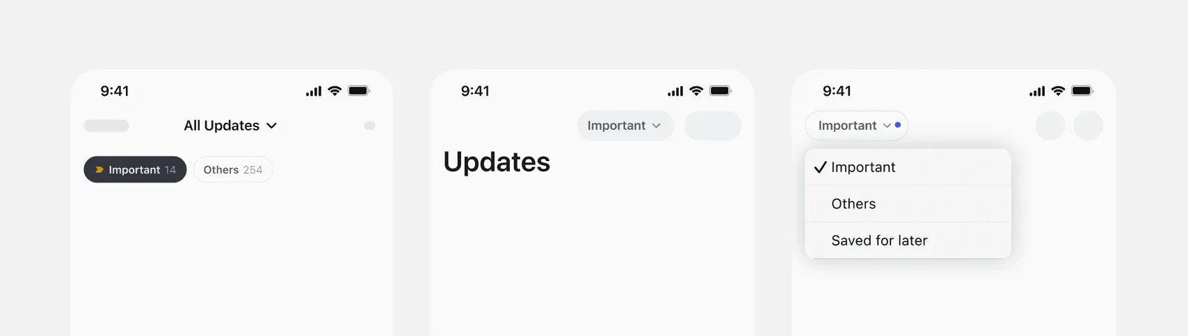
Updates can come in different types. To organize them and give users a list of the most important updates for them, we tried putting a number of quick filters.
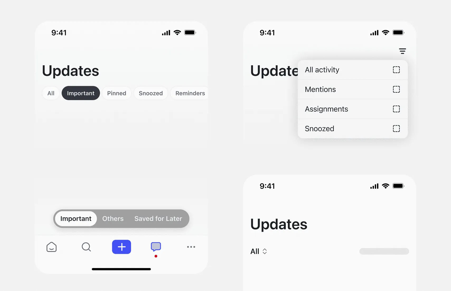
We narrowed the quick filters to Important and Others. Important opens by default and shows mentions, assignments, and comments on items you subscribe to. Others groups notifications by bot, so updates from Reminder Bot or GitHub Bot each appear in one row.
Here are a couple of placements I thought of.
Unread and All
We replaced the Unread and Read tabs with a single toggle between Unread and All.
This creates a simpler mental model as most users primarily want to see what’s new, and occasionally browse everything. “All” covers both read and unread, avoiding confusion from too many overlapping categories.
It also reduces decision fatigue. With just two clear options, users don’t have to think about where a notification might be. It’s either unread or part of the full list.
These felt a bit different from quick filters. I first saw them more like view toggles, even though they’re technically still filters. That’s why I considered placing or showing them separately from the quick filters.
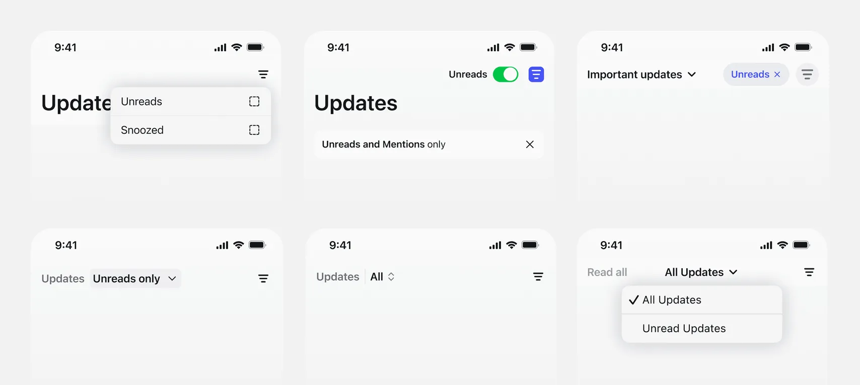
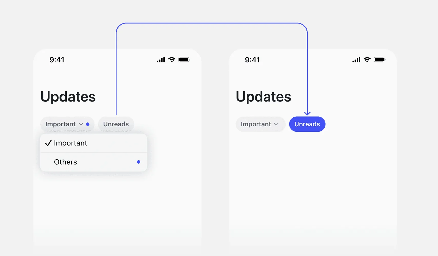
But later, I went back to a much simpler approach, removed anything that wasn’t the primary action and tucked the rest into a dropdown or toggle. Final version in the next section.
Putting it all together
We kept two quick filters, Important and Others, plus one toggle to show only unread items.
Update cluster list
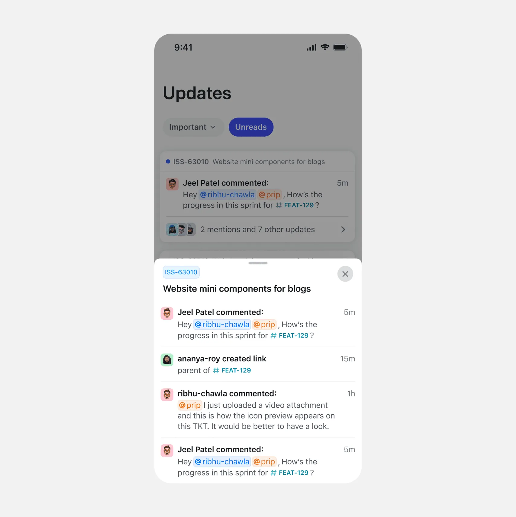
Expanding an update cluster
Clicking the footer of any cluster card opens a bottom sheet with all updates from that object for that day.
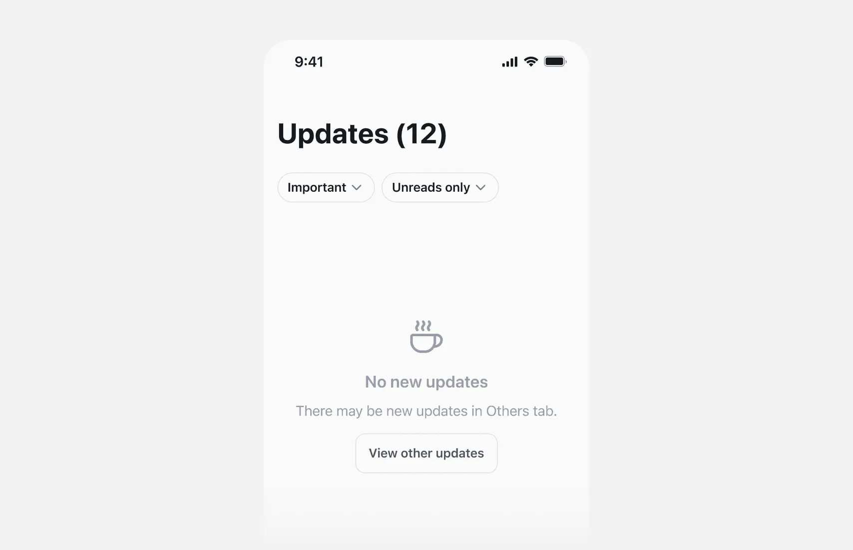
Empty states
I also considered the empty states. Included CTAs to ensure the user doesn’t get stuck in that state.
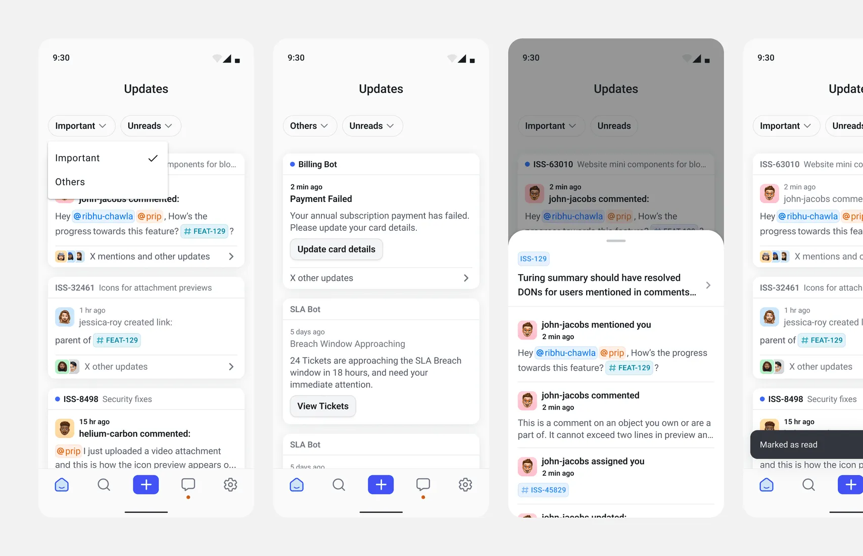
Android flows
Since the design system and styles for Android are different, I designed the necessary flows for Android.
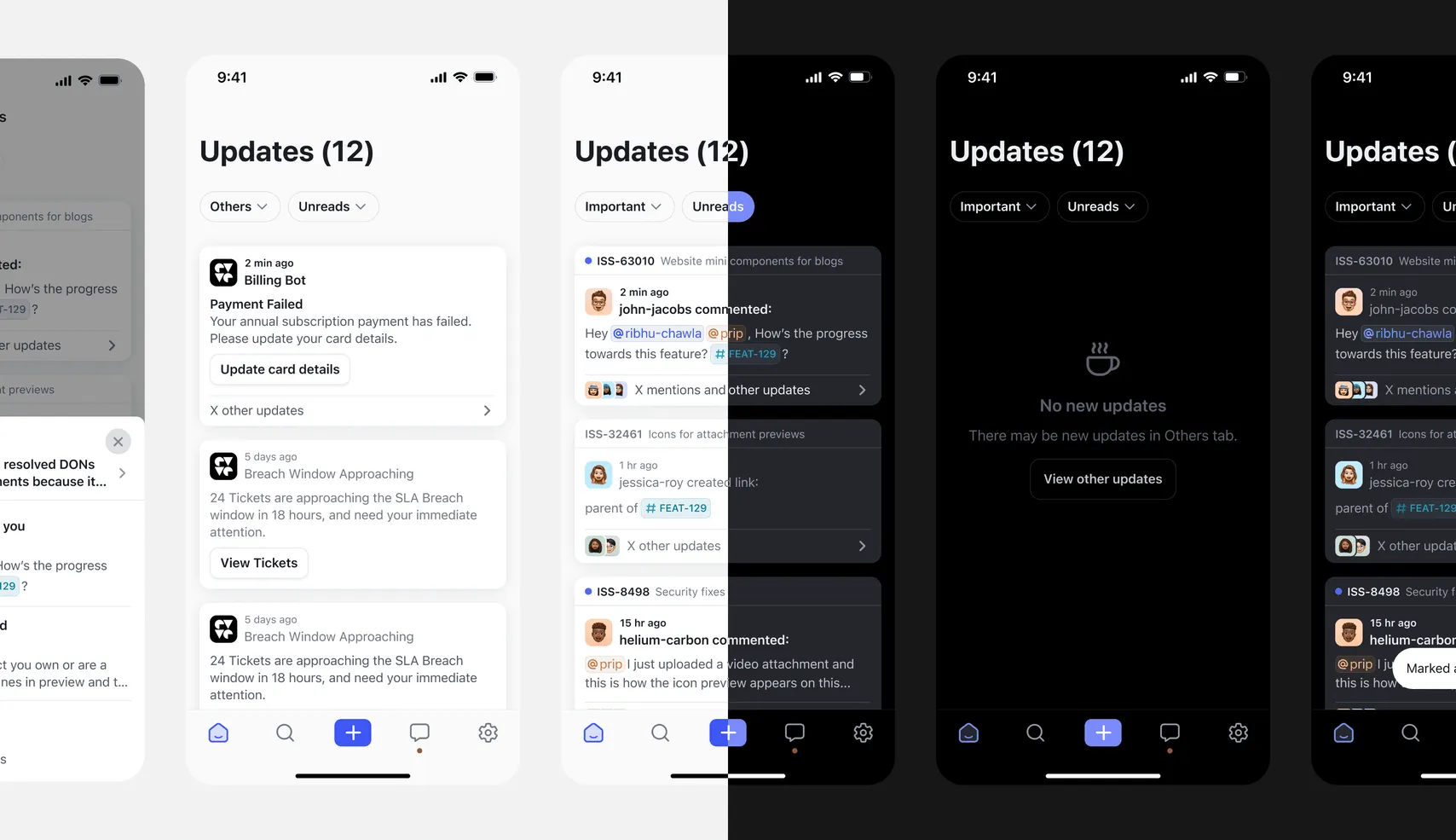
Dark mode
I also created dark mode designs for all screens on both iOS and Android.
Behind the scenes
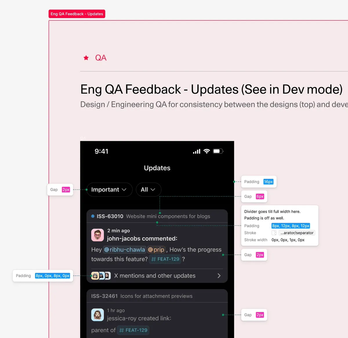
I used Figma annotations to document engineering QA.
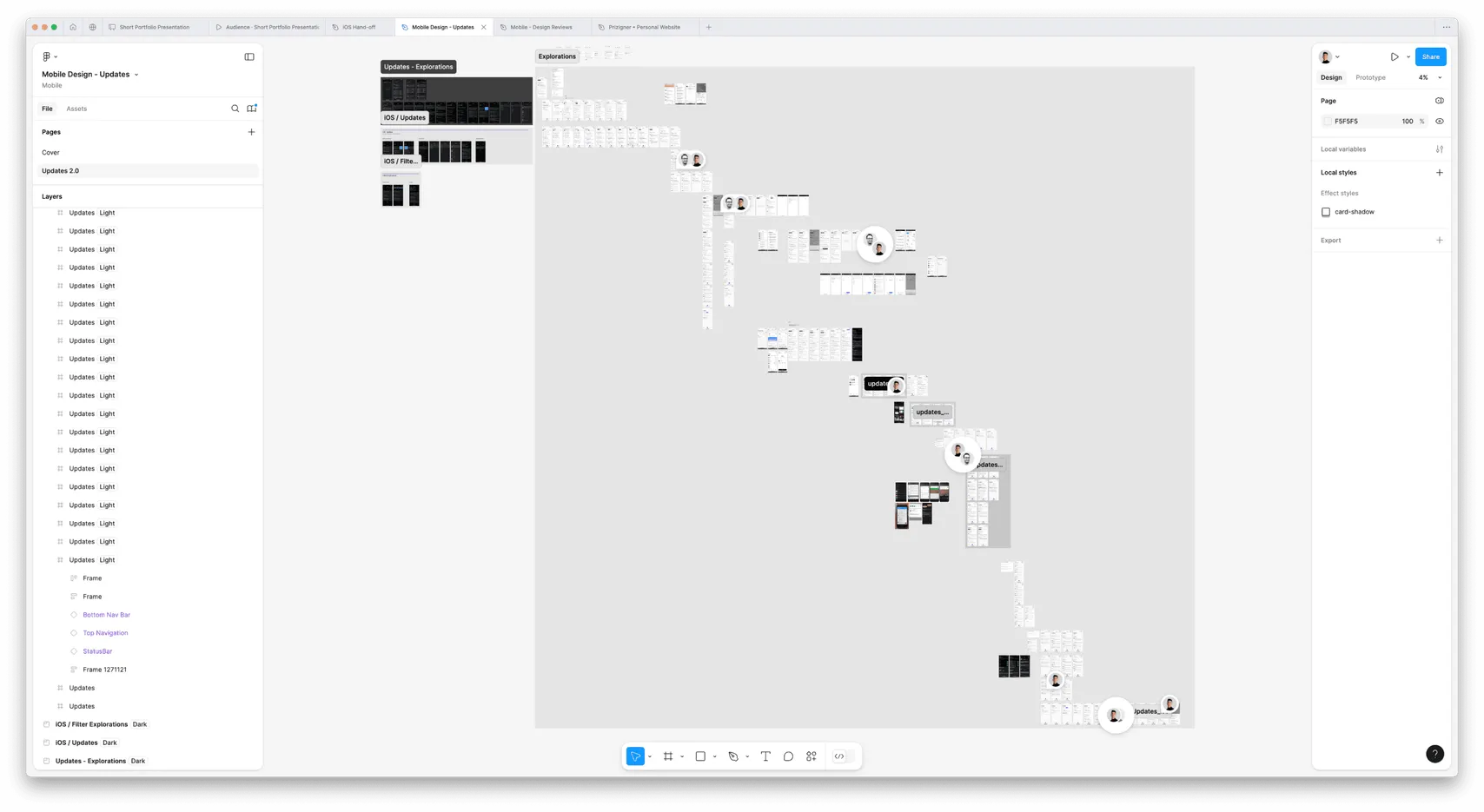
Next steps
I’d improve push alerts so the most relevant updates appear directly on the lock screen. For people who have notifications turned off, I’d try an occasional prompt to enable them so they can stay in sync with their team.

 New row
 Split transaction