
Improving the updates experience on DevRev mobile app
I chose to emphasize this project because it's the most in-depth one I worked on while at DevRev. I want it to show how I kept refining and improving a fundamental experience through many iterations.

Role
Product Designer
Team
8 people
Timeline
3 months
Problem
Lack of Clarity and Organization: Updates page lacks clear layout, hindering quick identification of important updates.
Insufficient Context in Notification Cards: Lack of descriptive info in notification cards limits understanding without navigating to associated objects.
Ineffective Prioritization of Updates: Default time-based sorting may bury critical updates among less important ones, risking oversight.
Noise in Inbox: Notification system overwhelms with new conversations, excessive notifications, and clutter, hindering productivity.
Outcome
We shipped a clutter-free and grouped updates experience that provides more context. The team included a designer (myself), a product manager, as well as the iOS and Android development teams.
The 3 objectives
To begin, I outlined three commitments that would determine the success of this project.
Clarity and organization
Allowing users to quickly identify and prioritize important updates.
Easy to revisit an update
Enabling users to revisit and take necessary actions on specific updates at a later time.
Context-rich update card
Providing users with better insights without having to open the update.
Exisiting experience

Solving the biggest huddle — Notification clustering
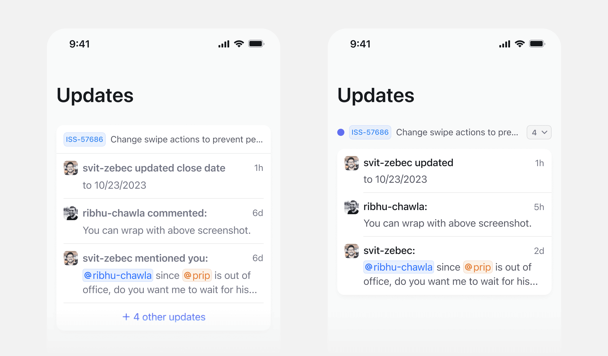
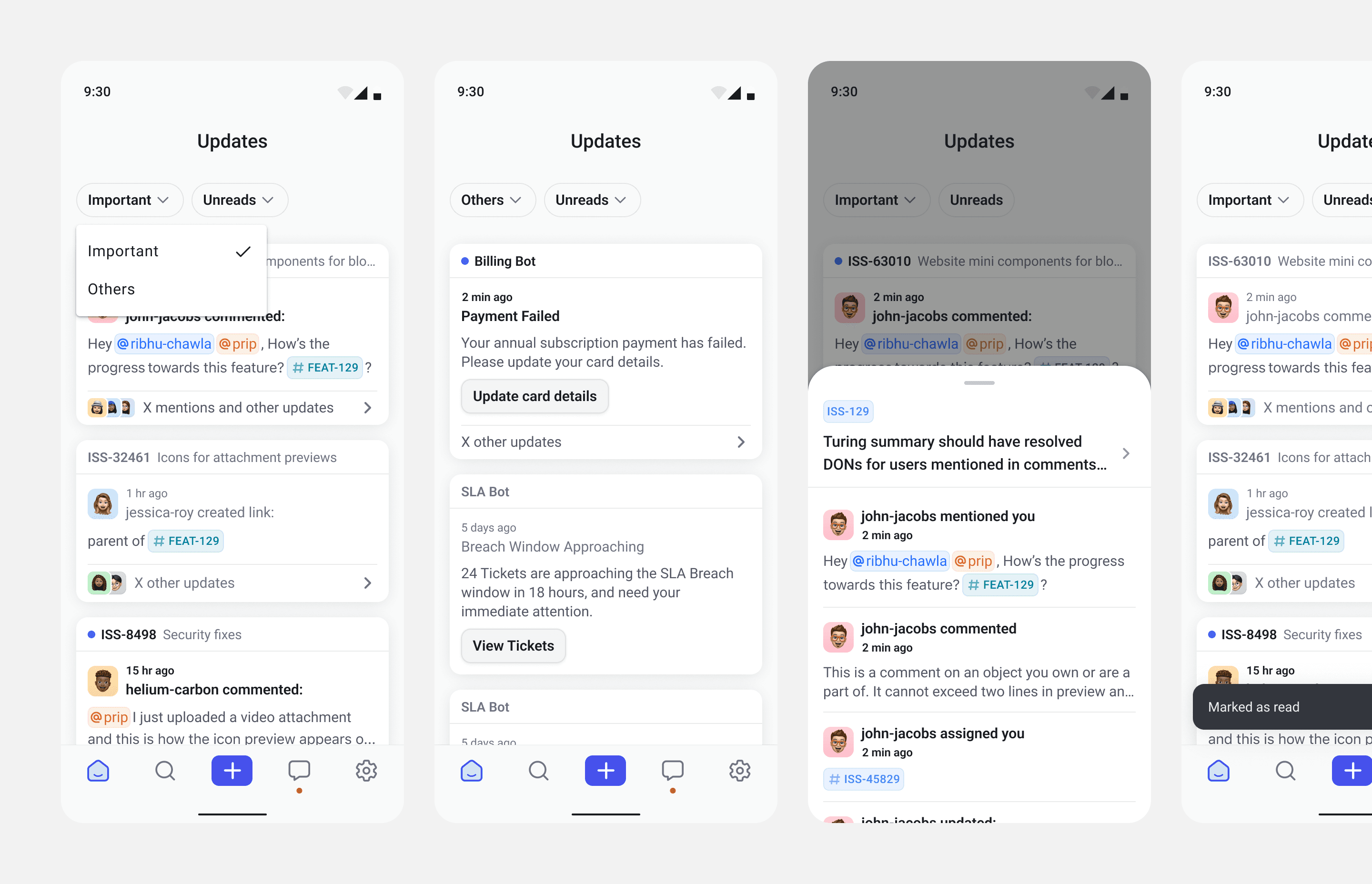
We replaced each notification line items with notification clusters/threads where each cluster will have all notifications of one object or one bot. All notifications of one specific object would be part of this notification cluster. This ensures user sees only one reference and latest information of the object
Show all three types of notifications in that object along with the sender, time stamp and actual message
Any action is taken directly on the cluster. These include snooze, mark-as-read, manage subscription.
I explored several variations for the notification cluster design. Here are a few key ones worth highlighting.

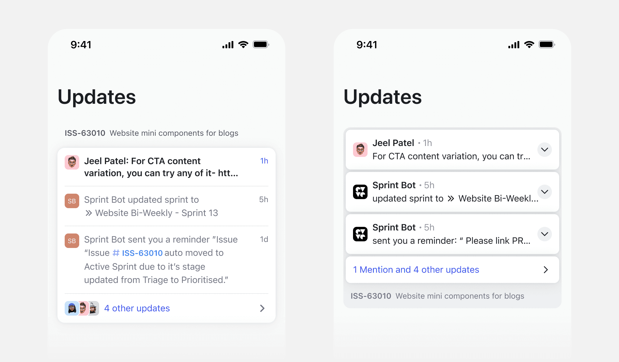
We chose this direction because it best met all our objectives. Swipe actions work more intuitively on the entire cluster, and the visual hierarchy felt the strongest here.

I looked at older versions of Android notifications and the Google Inbox app for inspiration. I think they did a great job with gestures and organizing information.

Actions on clusters
A cluster can have options to mark as read, snooze, or manage subscription.

Defining a great filtering experience
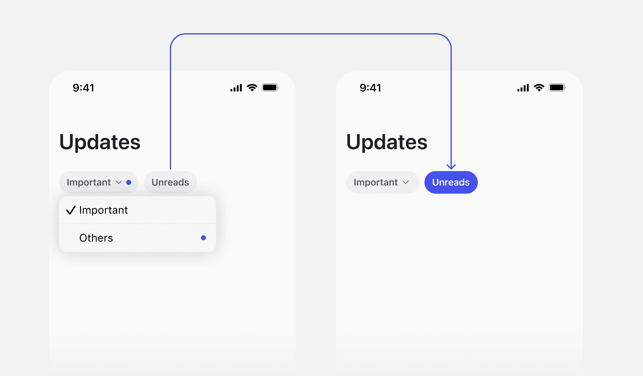
Updates can come in different types. To organize them and give users a list of the most important updates for them, we tried putting a number of quick filters.
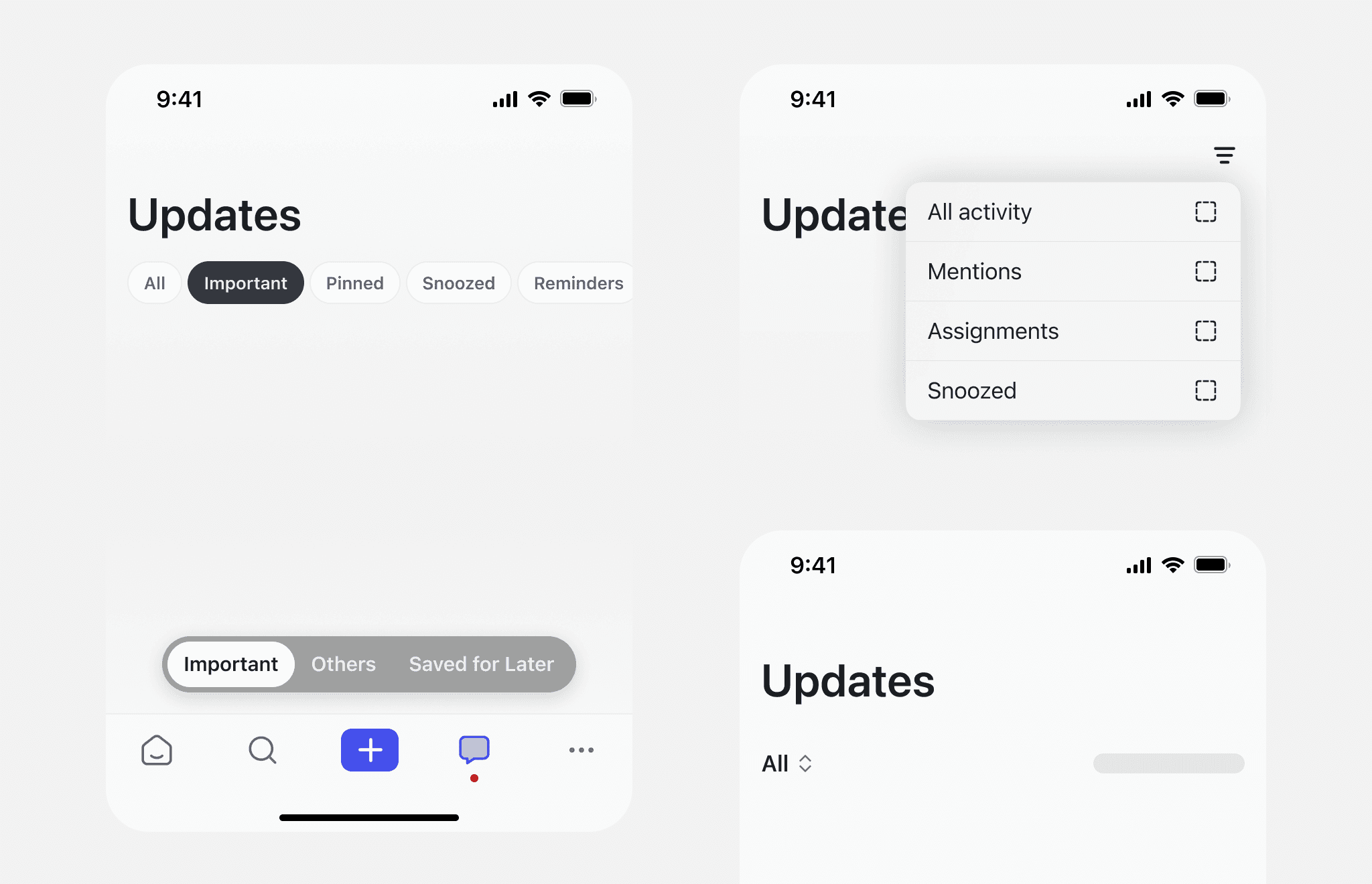
We then scoped down to having just 2 quick filters - Important and Others.
Important tab (which is open by default, eliminating the need for an 'All' tab) shows you updates where you were mentioned, assigned, or someone commented on an object you're subscribed to.
Others tab includes all notifications from one bot would be grouped by bot name under one group.(eg. Reminder Bot notifications or Github Bot notifications grouped in one row)
Here are a couple of placements I thought of.

Unread and All
We replaced the Unread and Read tabs with a single toggle between Unread and All.
This creates a simpler mental model as most users primarily want to see what’s new, and occasionally browse everything. “All” covers both read and unread, avoiding confusion from too many overlapping categories.
It also reduces decision fatigue. With just two clear options, users don’t have to think about where a notification might be. It’s either unread or part of the full list.
These felt a bit different from quick filters. I first saw them more like view toggles, even though they’re technically still filters. That’s why I considered placing or showing them separately from the quick filters.

But later, I went back to a much simpler approach, removed anything that wasn’t the primary action and tucked the rest into a dropdown or toggle. Final version in the next section.
Putting it all together
Filtering Experience
We agreed on a stripped-down filtering setup. Just two quick filter categories: Important and Others, plus a single toggle to show only unread items.
Update cluster list

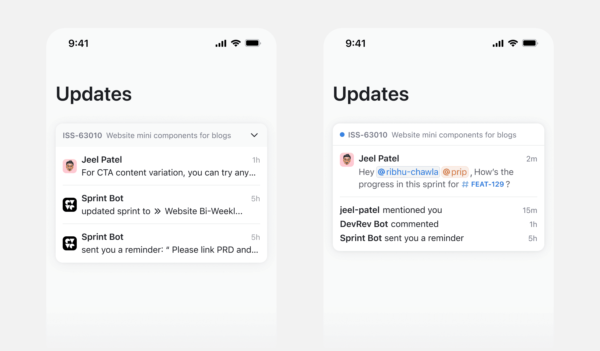
Expanding an update cluster
Clicking the footer of any cluster card opens a bottom sheet with all updates from that object for that day.

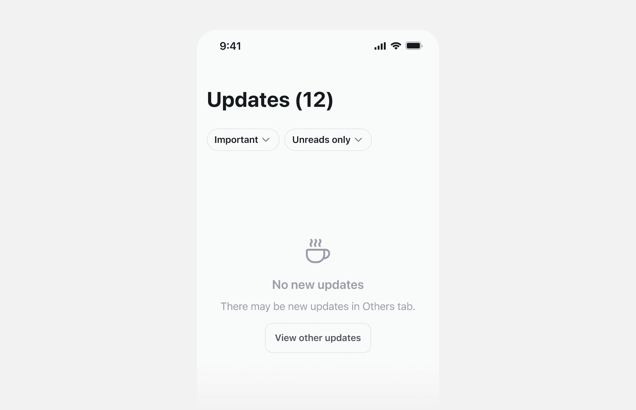
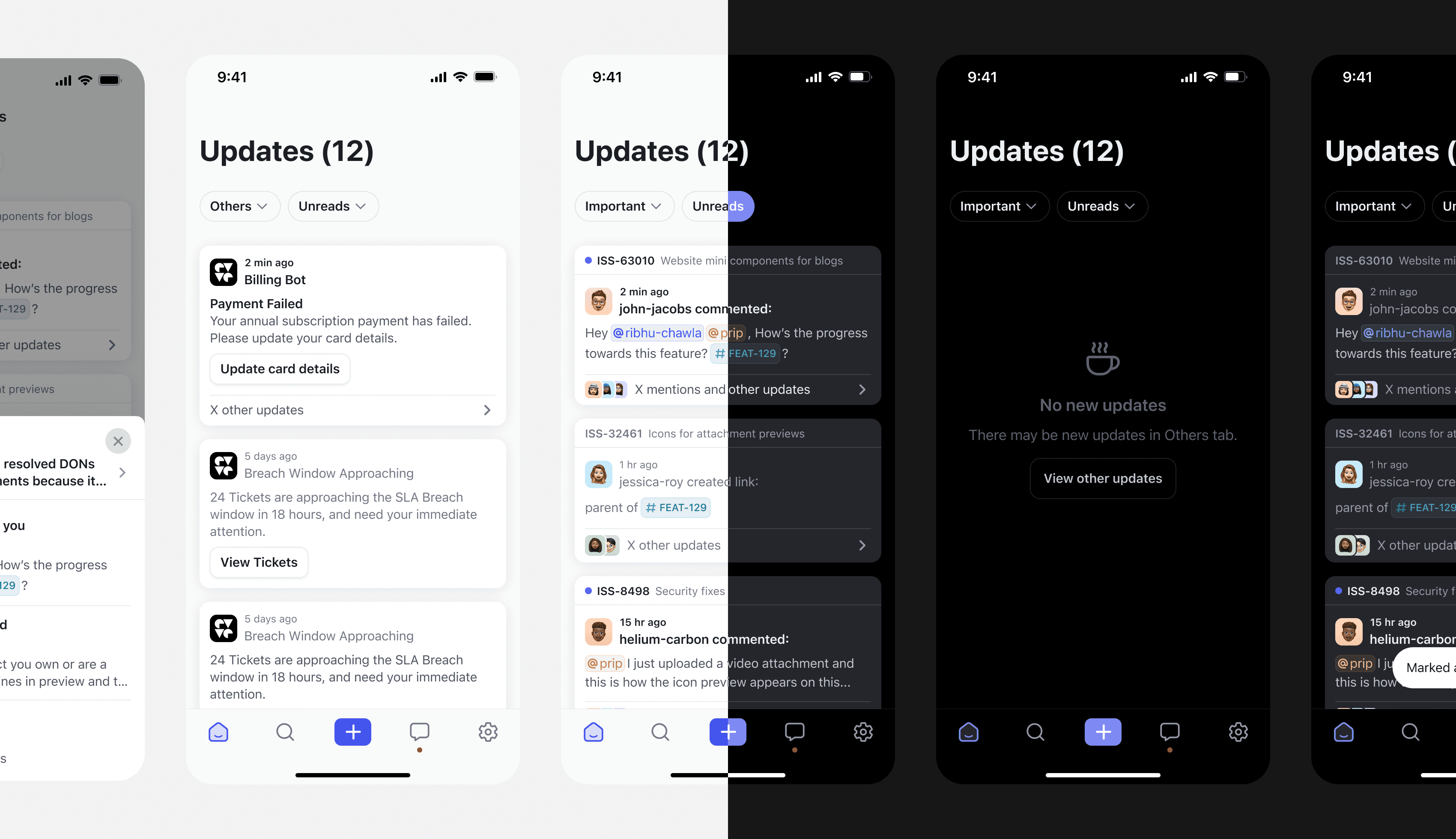
Empty states
I also considered the empty states. Included CTAs to ensure the user doesn't get stuck in that state.
Android flows
Since the design system and styles for Android are different, I designed the necessary flows for Android.
Dark mode!
I also created dark mode designs for all screens on both iOS and Android.
Behind the scenes


Next steps
I’d continue building on this project by strengthening the hook for the Updates page:
Lock screen notifications: Improve push alerts to surface the most relevant info right on the lock screen.
Prompting users to enable notifications: Since the Updates page is the key driver for return visits and staying in sync with the team, we should occasionally nudge users to turn on notifications if they’re disabled.


